Thursday, October 9, 2014
My House Animation
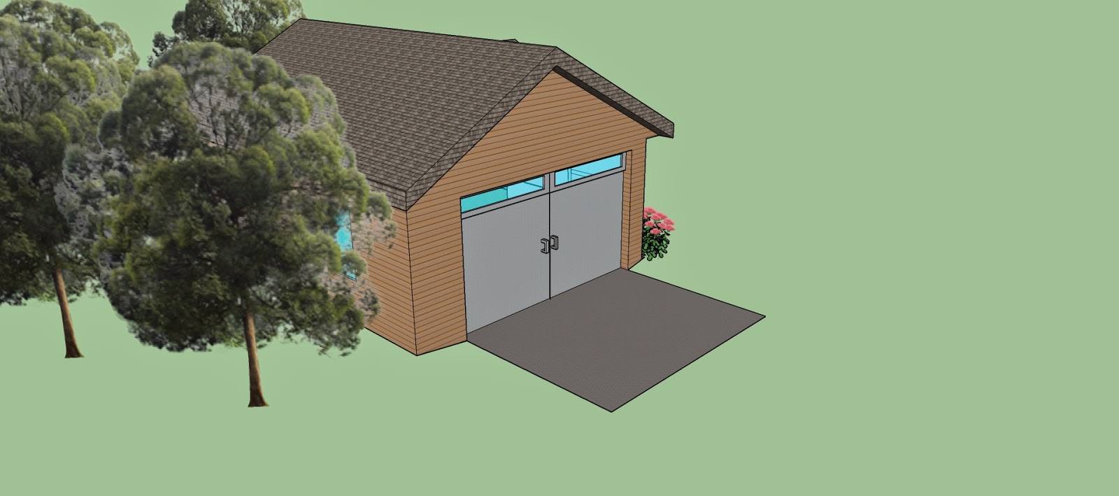
I liked my house animation and building. The house has many small details but I enjoy the simplicity it projects. Details include a garage with windows, details and the door, the window on the door itself and many other things. It looks sharp and clean cut. I would live in this house and it isn't too extravagant. The landscaping was pleasing yet not over the top.
I liked the textures and the colors used on the house. The roof is symmetrical and a good looking. The house has a nice wooden and home-like feeing. The windows have a great opacity and have a good color. I really like the door because it looks very realistic and fancy. The colors of the flowers are pretty and soft. The trees are placed in an orderly fashion.
This project has a good effect on my eComm experience and portfolio. It shows how realistic you can make something without using extremely advanced software. It also shows how much effort I put into my projects and how I follow all of the requirements. It has details that eComm is known for. This program is grey and I am enjoying my experience.
Labels:
animation,
Google SketchUp,
house
Subscribe to:
Post Comments (Atom)


No comments:
Post a Comment